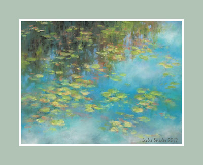
This post takes you through
the steps I used in creating
"The Lily Pond".
the steps I used in creating
"The Lily Pond".
Unlike "Across the Pond"
this has a very shallow sense of depth
or 3 dimensions.
So it's not technically difficult,
but the key is preparation and planning.
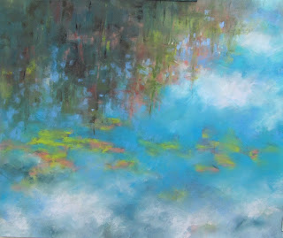
Using the colours (or similar ones)
from yesterday's palette
block in one layer of vibrant colour.
Be bold as it's easier to tone down ,
but impossible to bring back that purity.
There is a lot of blending at this stage
as we're creating the layer under the water surface.
Blend in the implied direction of the subject,
more vertical for the tree shapes
and more horizontal for the sky forms.
I include a few of the surface lily pads at this stage
(Orange/ yellow green and blues are compliments
and will create mud if blended.)
But keep this layer fairly light as we'll be building on it!
 |
| Step 02 |
 |
| Step 02a |
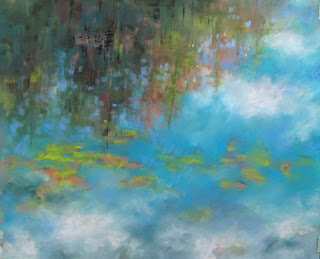
Here I'm tucking in the sky colour (blues,greys)
around the trees to add sparkle
and make the trees less dense.
 |
| Step 03 |
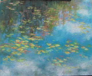
Next, develop the sky and clouds keeping the edges soft.
 |
| Step 04 |
Use a light touch to create the lilypads.
They are ovals (as we're seeing them at an angle)
and I try to emphasis the forward edge.
 |
| Step 05 |
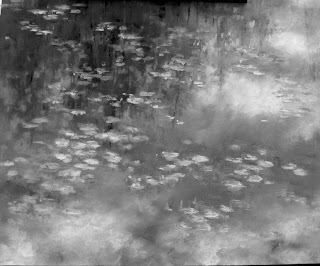
As the tonal range is limited
I looked at the design without colour
to check the compositional flow.
The lower left corner was a little too vague
I added some soft sky colour under the lily pads.
Final Step
Finally a few soft accent shadows
are added under the lily pads.
More could have been done at this stage
but liked the colour balance and freshness.
Monet is the most famous of waterlily painters
and I can hardly wait to study his work and ideas.



No comments:
Post a Comment